Knowledge Base
Time graph packet loss height
Question
Why do the red "packet loss" lines have different vertical heights on the graph?
Solution
Each "pixel" in the time-graph is comprised of anywhere from 1 to many samples. When you're looking at 5 minutes of data in a Timeline Graph, any sample will be multiple pixels wide (because the number of samples being displayed is limited). In this case, a lost packet will show 100% packet loss on the graph, and the red period will be multiple pixels wide.
Now, let's switch to the other end of the spectrum. Let's say you want to show 48 hours on the Timeline Graph, and during that 48 hours, you collected 172800 samples (or one sample per second). We're going to have a relatively hard time representing each of those samples on its own pixel when we only have about 500 pixels of width to work with on the Timeline Graph. So we average the latencies, and we determine a percentage of lost packets for that pixel width. In the
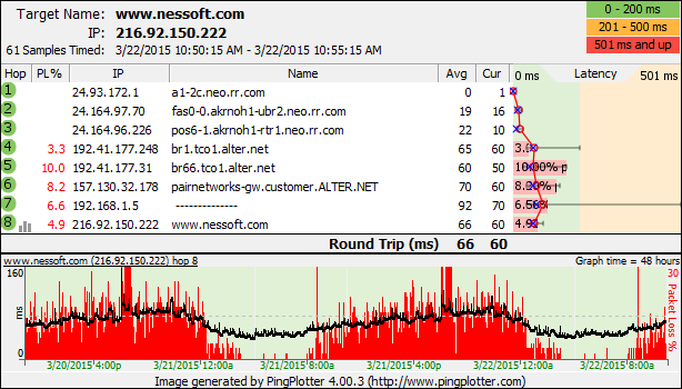
Now, sometimes you might have each pixel representing 8 samples (or maybe 4, or some similar small non-one number). This will happen if you're looking at one hour of data when the sample interval is 1 second and the width of the graph is 450 pixels. In this case, if one packet was lost, you'll see a jump in red-height of a fixed amount. Another lost packet will make it jump up another "chunk". As you look across a Timeline Graph like this, you'll see a number of red bars of equal height (1 lost sample out of 8, say), and a number of red bars of somewhat taller height (2 lost samples out of 8). These are kind of "plateaus" that seem to generally be hit - that's because we only lose packets in whole number increments. As you increase the amount of data you see at a time, the more smooth these packet loss lines get - and the more "trending" you'll see in packet loss data.
These same concepts with packet loss graph heights also apply to latency averages. If a single pixel width represents 20 packets, then the height of the bar in that pixel is an average (mean) of the latencies. If a single sample of that 20 is high, it will slightly increase the pixel height, but won't make it as tall as the maximum sample during that period. This means that the scale of the upper graph (which can graph minimum, maximum and averages) might be different than the scale of the graph on the bottom (which is graphing as much detail as it can, but might have to average some numbers to make it all fit). This actually works very well to see trending (since an individually high sample isn't very meaningful when you're looking at 50,000+ samples ) but can be slightly confusing when you first see this happening.
The graph above shows a perfect example of how this averaging is helpful - you get to see packet loss trends over time.