Hey Mike,
Thanks for writing in - and thank you for trying out PingPlotter!
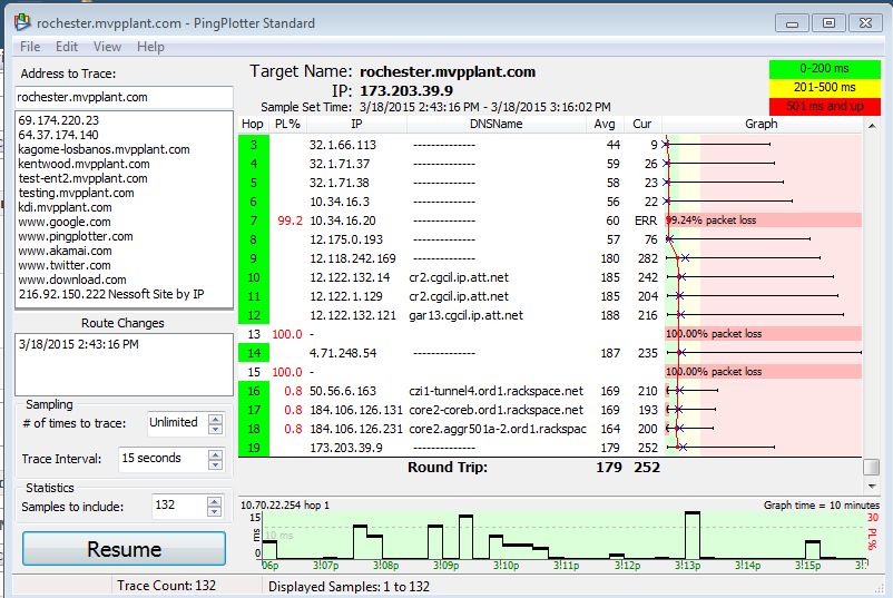
It *looks* like the timeline graph you have open in PingPlotter is for your 1st hop (and not your final target, which *is* reporting a much higher round trip time than hop #1). You can open up additional timeline graphs (including one for your final destination) by either double clicking on any hop, or right clicking and selecting "Show this timeline graph" (and the same options can be used to hide the graphs).
We cover this in a bit more detail in a section of our manual, which you can find here (be sure to check out point #6, specifically):
http://www.pingplotter.com/manual/standard/theinterfacegraphs.htmlHopefully this helps out! If you should find yourself with any other questions - please don't hesitate to let us know.
Best wishes,
-Gary


 Previous Topic
 Index
Index